The C1RadialMenu is a control that allows radial organization of elements. The radial menus can be nested to any depth that you desire, and you can add as many items to the radial menu as you need to add.
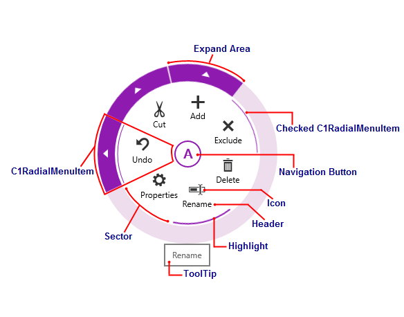
The following image diagrams the elements of the C1RadialMenu control.

The elements of the C1RadialMenu control can be described as follows:
The main radial menu is a circular, top-level context menu control. It is comprised of first-level C1RadialMenuItems and can hold any feature available to C1RadialMenuItems.
Radial menu items are represented by the C1RadialMenuItem class. C1RadialMenuItems can have a Header and an Icon, and you can also set them as Checkable. Each radial menu item might be associated with a Command, which is invoked when the button is pressed. A C1RadialMenuItem that contains child items will also have an Expand Area.
The C1RadialMenu is split into sectors. The C1RadialMenu control will automatically create the sectors based on the number of C1RadialMenuItem your control contains, but you can customize the number of sectors using the SectorCount property.
When a user right taps the application, the Navigation Button will appear. Tap the Navigation Button to show or hide the C1RadialMenu. This button will turn into a back arrow when a user navigates to a submenu.
Using the C1RadialMenuItem.Icon property, you can customize the icons that appear on your C1RadialMenu.